Wednesday, December 20, 2006

Trees Don't Spin: Plants respond to the big picture


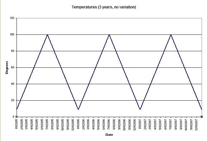
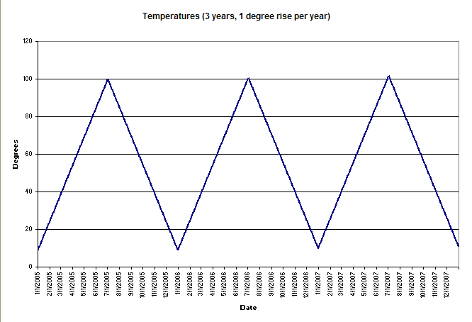
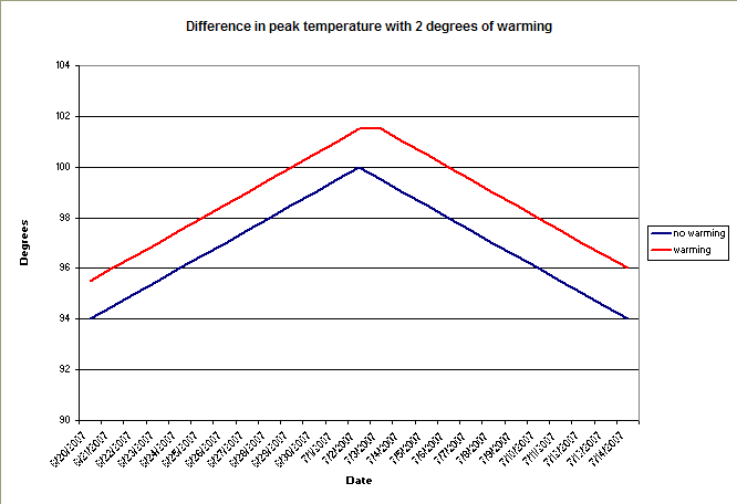
The Washington Post provides a dramatic illustration for what I've been saying about climate change being imperceptible from one year to the next, but indisputable when viewed over recent decades. The source is the National Arbor Day Foundation, hardly a hotbed of half-baked hyperbole:

A warming climate in the Washington area is beginning to affect the area's trees, with cold-loving species finding the weather less welcoming and southern transplants thriving, according to findings released yesterday by the National Arbor Day Foundation.

In a revised map of "hardiness zones" -- bands of similar temperatures where similar trees are likely to grow in winter -- the foundation reclassified the entire Washington area in the same zone as parts of North Carolina and Texas. In 1990, the region was on the border of northern and southern growing zones, but a foundation official said that has changed after 15 years of balmy winter weather.

The foundation's findings provide a window into the local effects of climate change, scaled down to lawn level. Colorado blue spruce and hemlock, at home in the cold, might have a harder time. Crape myrtles and camellias will have it easier.

"You could say D.C. is the new North Carolina," said Bill McLaughlin, a curator at the U.S. Botanic Garden on the Mall.

The Washington area's warming trend is one of many that the foundation detailed across the country as it presented its updated map.

In parts of Michigan, for example, the climate has warmed enough to accommodate southern magnolia trees, said Arbor Day Foundation spokesman Woodrow L. Nelson. Arizona cypress, another southerly species, also suddenly seems a better fit for some sections of the Northeast, he said.

"I mean, who would have thought that an Arizona cypress would be a choice for someone in New Jersey?" Nelson said.

The map divides the continental United States into nine zones, from Zone 2 near the Canadian border to Zone 10 at the tip of Florida. (Zone 1 is found only in Alaska's frigid interior, Zone 11 only in tropical Hawaii.) The zones were mapped by examining local weather data and averaging the lowest temperature recorded in the 15 previous winters.

The last time the U.S. Department of Agriculture presented such a map, in 1990, the Washington area sat on the boundary of two of these bands. Part was in Zone 6, an area from Massachusetts to Kansas where the lows hovered between zero and 10 degrees below. The other part was in Zone 7, stretching across the upper South, where temperatures were between zero and 10 degrees.

But in the foundation's revised map, the southern climate zone has swallowed the remainder of the area, taking in parts of the District, Montgomery County, and western suburbs in Virginia and Maryland. All of Zone 7 has shifted north. The zone now takes in most of Tennessee and Virginia as well as parts of North Carolina, Arkansas and Oklahoma.

Tuesday, December 05, 2006

Why we still have cold winter days during global warming

Every year, wingnuts and oil executives feel the chill of a winter day and say, "See, no global warming here!" Every year, I vow to put together a few simple graphs that will show how dumb their arguments are. Usually I get sidetracked, often by the call of the snow on the mountains. But today is a cold December day, we haven't had any snow yet, and I've taken a little while to crunch some numbers.

Please bear with me while I explain a few graphs.


The graph above shows the way most people think about weather. We tend to perceive a steady wave pattern, where the temperature is cold in the winter, then gets gradually warmer until the middle of the summer, and then gets colder again. In the graph above, I made up some numbers, with the average temperature rising 1/2 degree every day from Jan. 1 until the beginning of July, and then falling 1/2 degree every day from the July until New Year's Eve.

In the first graph, I kept the temperatures constant from one year to the next. Now, how would this graph look if average daily temperatures rose by one degree a year? In the graph that follows, I've done just that, incrementing the average temperature up 1/2 degree in January and 1/2 degree in July. What do you notice?


You probably don't see that much difference between the two graphs. The summers are still hot, and the winters are still cold. The only difference is that the summers are just a little hotter, and the winters are just a little less cold. You can see this better if we zoom in on the peak of the graph, the imagined days at the beginning of July when the mercury stops rising and starts to sink back down. In the next graph I've zoomed in on the mythic warmest days of summer. The blue line shows the peak from the third summer of the top graph, where we held temperatures steady from year to year, and the red line shows the peak from third summer of the second graph, where we showed that temperatures had risen by two degrees.


Notice how every day was just a little hotter with a warming trend than without it (1.5 degrees hotter on the way up, and 2 degrees hotter on the way back down after I added in the 1/2 degree increment that my model puts in every sixth month). However, no particular day in June or July was noticeably out of the ordinary for that time of the year. Instead of reaching 98 degrees on June 29 in the steady-state model, it reached 98 degrees on June 26 with warming, and June 29 was just a little warmer than that. Really, on a day to day basis you would not notice the warming trend, even though each and every day was just a little warmer than it had been historically.

What these models don't show, of course, is the natural variability in the weather. High and low pressure fronts pass through, the jet stream slides the winds around, and one day is colder or warmer than the next. In October or April you might have one day that is 65 Fahrenheit, and the next day is 30 - the difference between comfortable and frigid. And then the next day it will pop back up to 50, and then down to 40, and then up to 65 again, and then down to 30. Here's a graph with data from the Temperature Data Archive that shows actual average temperatures for Hartford, CT, for 1995:


See how the average temperatures generally follow the same trend that's shown in the make-believe graphs above, but have huge swings off the trend line on a day to day basis? Every day in July was warmer than every day in January, but the coolest day in July was almost as cold as the warmest day in January. If we zoom in on any given month, we'll see that some days are warm and some are cool, but they are basically in keeping with the range of expectations for that month. Here is December 1995:


That December had a day that averaged a balmy 45, and a week or so later there were a few days that averaged around a bone-chilling 15. It would have been just as silly to say that the 45 degree day was "proof" of global warming as it would have been to say that the 15 degree days were "proof" against global warming. No single day can give you that sort of proof, because Mother Nature provides plenty of day-to-day variation within the cycle of the seasons.

The only way to demonstrate whether or not global warming is actually occuring is to look at averages over time. If the average temperatures from year to year are trending higher, then we have a situation that, accounting for normal day-to-day fluctuations, is much like the one shown in the second and third graphs. Here is a graph that does just that, using a variety of actual data over 30 years:


(Click here for more about that graph, and links to others.)

So, do not let the noise machine fool you the next time you see a headline on a cold winter day that says, "Global Warming, Huh?". Think about how the weather really works, and look at the trends over time. And then be afraid, be very afraid, because the trends are all pointing toward a world that we are making warmer than humans have ever experienced.